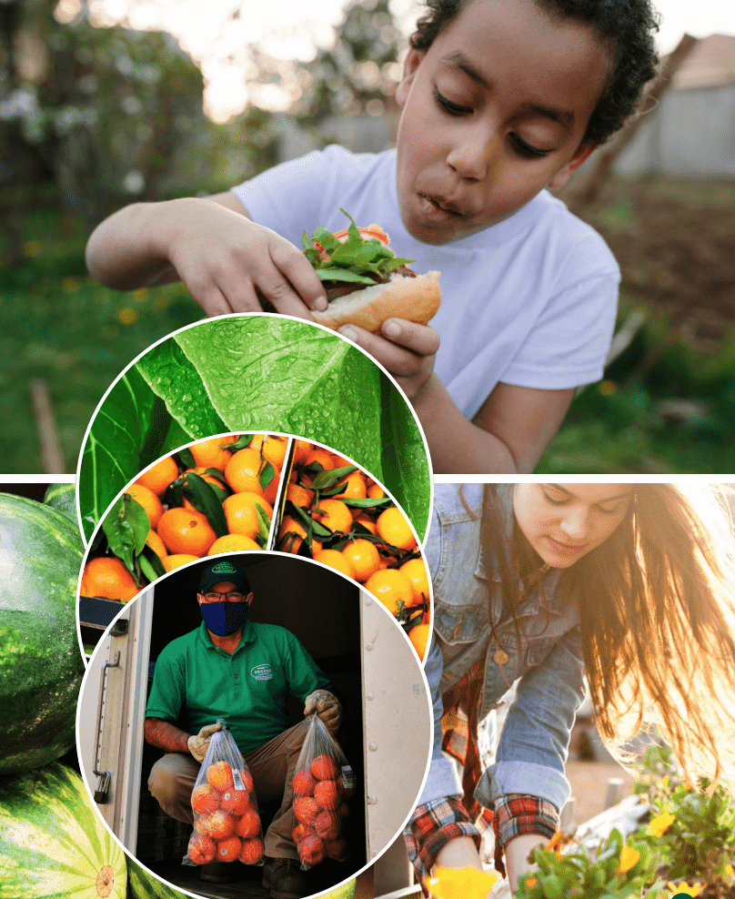
Decades ago, we had an idea. What if we rescued fresh food from local grocers, farmers, manufacturers, and distributors before it expired or went to waste? Then, we could redistribute that surplus food to our community food banks, agencies, soup kitchens, schools, and other organizations that needed it! Since 1985, Second Harvest has rescued and delivered more than 177 million pounds of food, preventing over 75 million pounds of greenhouse gas equivalents from entering our atmosphere.
What started out as a brilliant idea at a grassroots non-profit organization in Toronto has since expanded to meet the growing need across the country, changing the lives of (and inspiring action from) millions of Canadians. Second Harvest has proudly become the largest food rescue organization in Canada and a global thought leader on food recovery, food waste, and hunger relief.
Our original grassroots mission hasn’t changed, but our national and digital scale and vision have given it a renewed sense of purpose. In the spirit of renewal, Second Harvest is thrilled to announce the launch of our brand refresh!
“This has been an important journey,” CEO Lori Nikkel says, “starting from our humble roots serving the Toronto community and now to a national organization serving over 900 communities. This is an exciting time – a time to share Second Harvest to all Canadians with a new look that represents the organization we have become, a unified brand that clearly showcases our values, mission and vision of a Canada with No Waste and No Hunger.
Introducing Second Harvest’s Brand Refresh
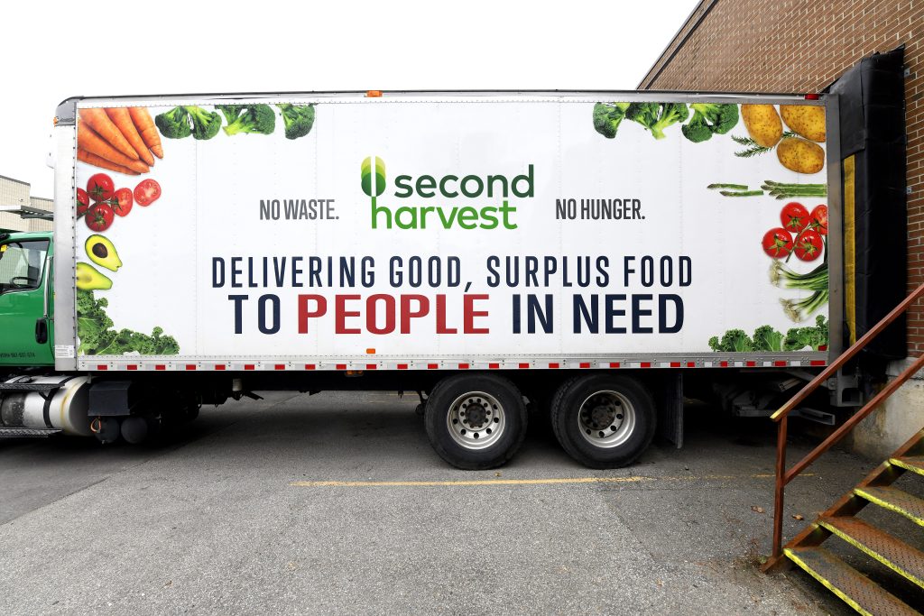
As we’ve expanded to help communities across Canada and online with our food rescue app, our logo and brand name have been invaluable. Second Harvest is synonymous with our vision of No Waste. No Hunger. Even the words Second Harvest remind us every day that we’re reviving—or renewing—the original and sole purpose of food: to eat it! Not to let it go to waste, as so much of the food grown in Canada and worldwide does (and is expected to).
Our Second Harvest Logo Renewed and Refreshed
We’ve chosen to add three green interlocking circles to our logo to symbolize growth, just like plants and crops that come to life in the spring and grow toward the sun through summer until harvest. But more than representing the growth and harvest, the interlocking circles are a trinity of real change.
Each circle of growth is unique and connected to the next. Together they represent the important aspects of Second Harvest’s mission:
- Introduce new ideas and innovative ways of thinking.
- Create and build the tools to affect change and transform how we care for the planet.
- Seek people who are inspired to find ways to rescue and renew food and avoid waste.
Our new logo font is a modern font in lower case that we believe is open, friendly, welcoming, and reflects our growing position on the world stage.
National and Bilingual Identity
What started out as rescuing food in local communities in the GTA, has quickly expanded across the country as increased food insecurity and waste demanded it in the wake of the pandemic.
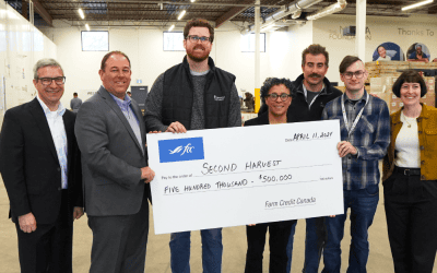
Second Harvest now redistributes surplus food to a broad network of over 3,000 agencies. Hundreds of communities from PEI to BC and as far north as Clyde River, Nunavut receive rescued food from Second Harvest. This was only possible because of our incredible partnerships with over 4,500 food donors, not to mention the army of workers and volunteers at non-profit organizations.
Now that we’re working on a national scale and representing Canada’s food recovery efforts worldwide, we redesigned our logo to reflect our English and French identity.
A Brand Refresh That Reflects our Mission and Vision for the Future
Everything about Second Harvest’s brand refresh is meant to reflect our growth and our renewed vision (and hope and drive) for a sustainable future for Canada: No Waste. No Hunger.
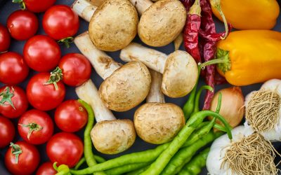
For example, our primary colour palette is green to represent growth and sustainability. Our secondary colour palette is inspired by fresh produce, that we hope stays on our plates (and into our bodies as nourishment so that we can flourish and thrive) and out of landfills.
Likewise, our brand voice aims to inspire change for the better and attract passionate, like-minded people and partners who share our common goals. That voice is clear, caring, kind, and informative.
We have created a brand that represents a secure and sustainable future we—as Canadians and local and global community members—are all working towards. We hope that our brand refresh will continue to inspire and attract ideas, tools, and people to make real change for good.